Case study · Logo design
US SaaS startup: logo that survives the app icon grid
A seed-stage product needed a mark that worked in dark-mode UI, slide decks, and 32×32 favicons before the next fundraise.
Orbit Apps · Software / SaaS · United States
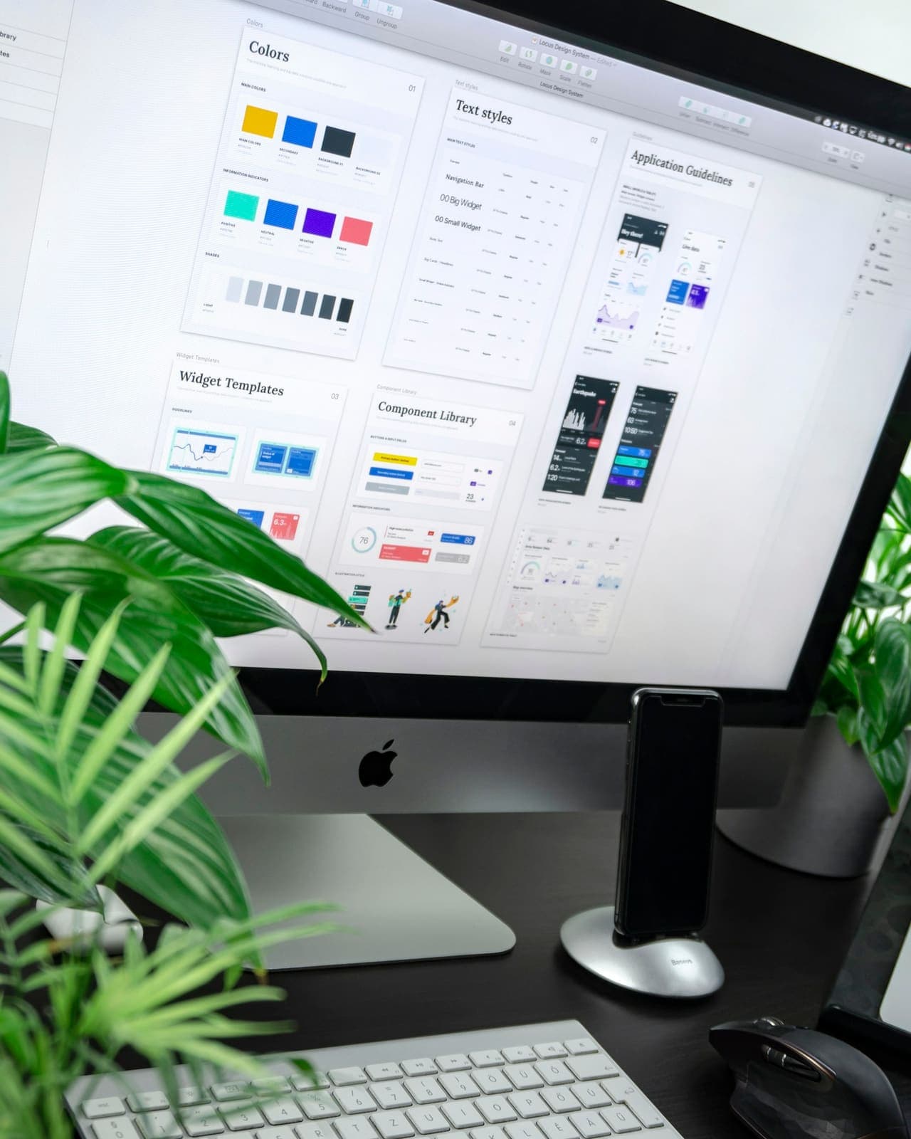 Before
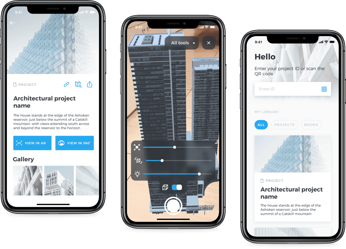 After
Challenge
Early DIY marks fell apart in the App Store grid and looked different on every landing page mock.
Approach
Icon-first exploration, monochrome lockups for invoices, and a simple brand guide so engineers and marketers stayed aligned.
Results
- App icon and nav mark from one geometry system
- Deck-ready wordmark for investor updates
- Faster handoff to the marketing site redesign
“We finally have a mark that looks intentional in the product — not just on a pitch slide.”