Case study · Logo + packaging
Black Ring Coffee: from generic cup to shelf-ready brand
A US coffee brand needed a mark and cup system that stood out in delivery apps and on the counter — without looking like every other bean logo.
Black Ring Coffee · Food & beverage · USA
 Before
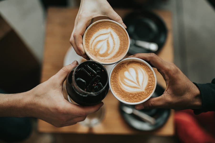 After
Challenge
The previous mark was hard to embroider, muddy at thumbnail size, and inconsistent across cups, sleeves, and Instagram.
Approach
Contest concepts explored bold geometry and roast personality, then packaging and sleeve layouts locked a one-color print system for high-volume cups.
Results
- Clearer brand recognition on delivery-app thumbnails
- Print-ready cup and sleeve files for US vendors
- Consistent social avatars and story templates
“We wanted something fun that didn’t look like every other coffee logo — and we got options we could actually produce.”